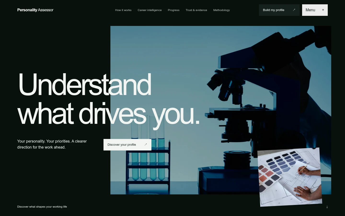
The design challenge was to make an assessment understandable without presenting it as an identity or a diagnosis. We kept the answer, the calculation and the explanation as connected, distinct parts of the experience.

Can guidance show its working?
A result should lead back to its source. The product keeps a response visible through scoring, confidence and matching, with an optional narrative layer that explains rather than replaces the calculation.
Every screen.
The same intention.
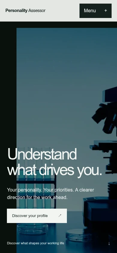
The experience is reworked for a smaller screen, with the same care for the journey. Explore the live site or open it in your browser.
Follow the decision.
Response
↗Contributions
↗Scoring
↗Confidence
↗Guidance
A simplified illustration of the product workflow.
More context.
The same person.
The answer remains visible.
I enjoy finding patterns in complicated information, then explaining what I notice.
Illustrative response. No personal data is collected.Keep the answer attached.
A response can contribute to personality dimensions, interests and work values. The living record preserves those relationships instead of collapsing them into a single opaque label.
Show the strength of the evidence.
Confidence and completeness help put a score in context. Career matching adds reasons and gaps, making comparison more useful than a ranked list without explanation.

Let explanation remain optional.
Deterministic scoring and career matching sit apart from AI generated narrative. An explanation can help someone understand the record without becoming the authority that decides the numbers.

separate calculation from interpretation. This is a tool for reflection and nonclinical career exploration, with the original response retained as the point of reference.
What could we build for you? ↗